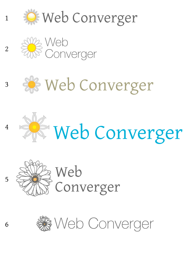
What is your favourite logo?
I've just released Webconverger 2.37, based on the new lenny release, though without the earlier promise of splashy. This means Webconverger is even more likely to just work, especially on newer hardware.
I have not setup splashy because I've yet to decide on the new artwork to use. I'm also toying with the idea of not having a splash screen at all as it is useful to see network information and update information. Though I have received complaints that the black screen of text scares people... :/
My designer friend Hawken King (and old fellow QuakeWorld TF-er) has contributed some designs. Which one do you like? Please help me decide via the feedback form on Webconverger.com.
Thank you!
